
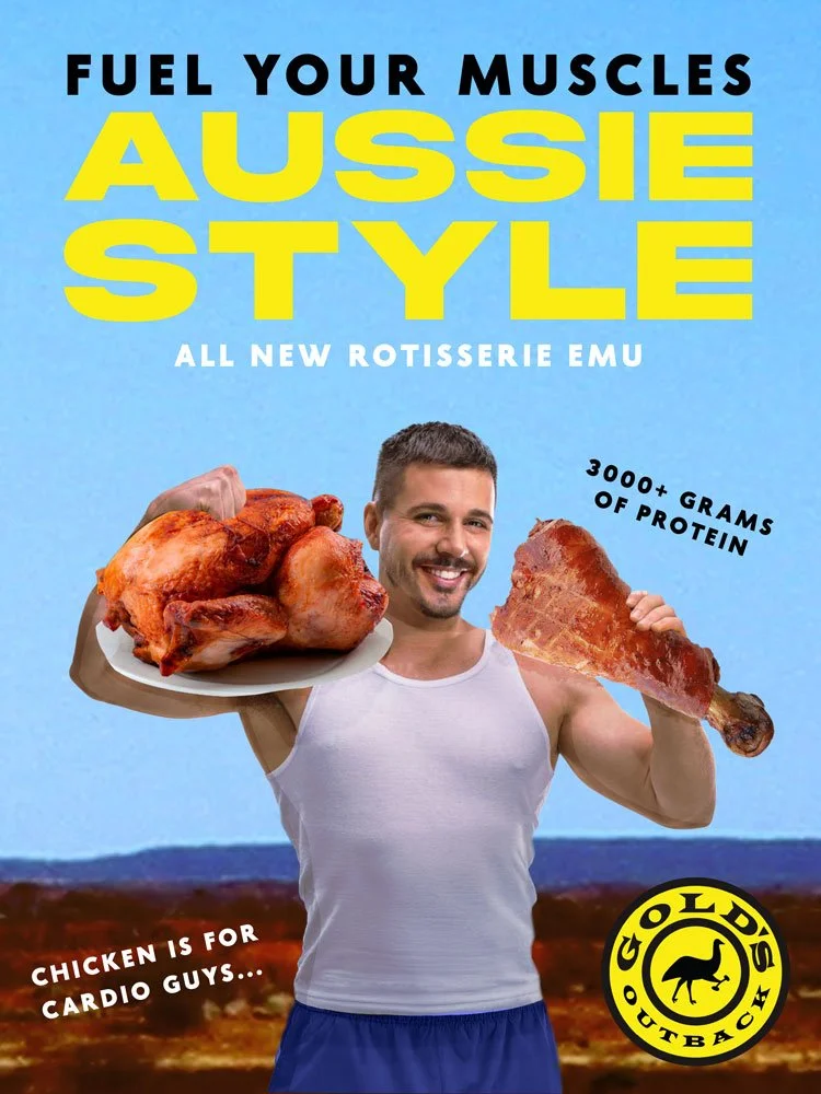
Gold’s Gym and Outback Steakhouse combine in this unified advertisement, offering a new “Rotisserie Emu” targeted towards gym bros who need a protein boost.
Gold’s Gym, founded in 1965, has built its brand around strength, discipline, and masculine fitness culture, while Outback Steakhouse, established in 1988, embraces a rugged Australian identity and hearty portions of meat. Both brands appeal to audiences that value physicality and indulgence, which made them a natural fit for this parody campaign. My concept plays on the protein obsession in fitness culture, where gym influencers and “bro” communities constantly promote eating chicken breast for gains. I wanted to exaggerate that obsession by taking it to an absurd extreme, introducing an even bigger bird: the emu. This idea ties humorously into Outback’s Australian theme while maintaining Gold’s Gym’s hyper-masculine tone.
Visually, I drew from both brands’ aesthetics, clean, bold typography inspired by Gold’s Gym and bright, earthy tones referencing the Australian desert color palette. The slogan “Fuel Your Muscles Aussie Style” reinforces the absurdity of combining two worlds that normally wouldn’t intersect. I used persuasive strategies such as attractiveness, featuring a conventionally fit man to embody the “ideal” gym-goer; bandwagon appeal, suggesting that this new emu dish is what all serious lifters eat; and exaggeration, emphasizing “3000+ grams of protein” to parody fitness marketing’s obsession with numbers. The phrase “Chicken is for cardio guys” uses competitive comparison to provoke gym culture’s playful hierarchy. Through this spoof, I critique how fitness advertising often uses unrealistic imagery and overblown claims to sell products under the guise of health and masculinity. My design exaggerates these tactics to reveal their ridiculousness while maintaining the polish and believability of a real ad.
Research
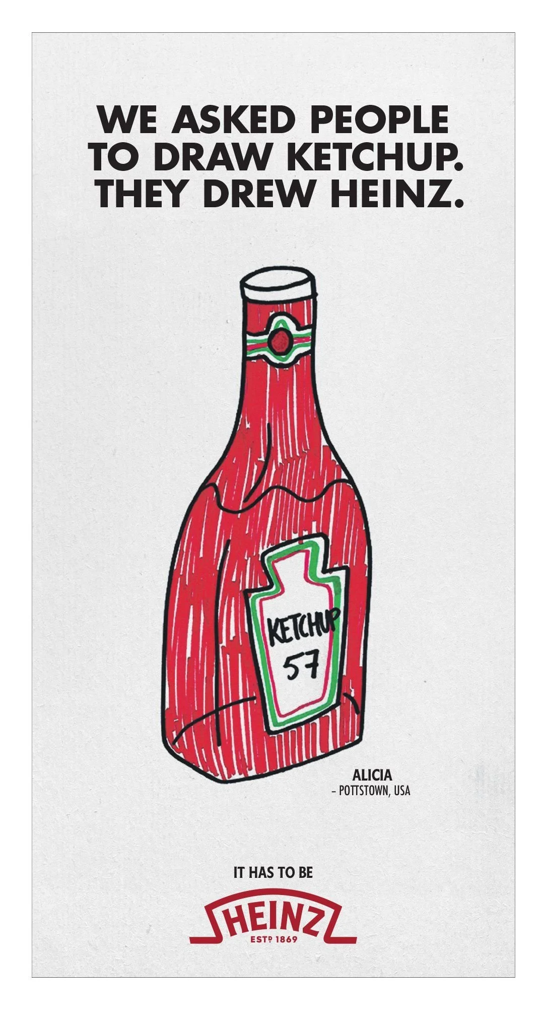
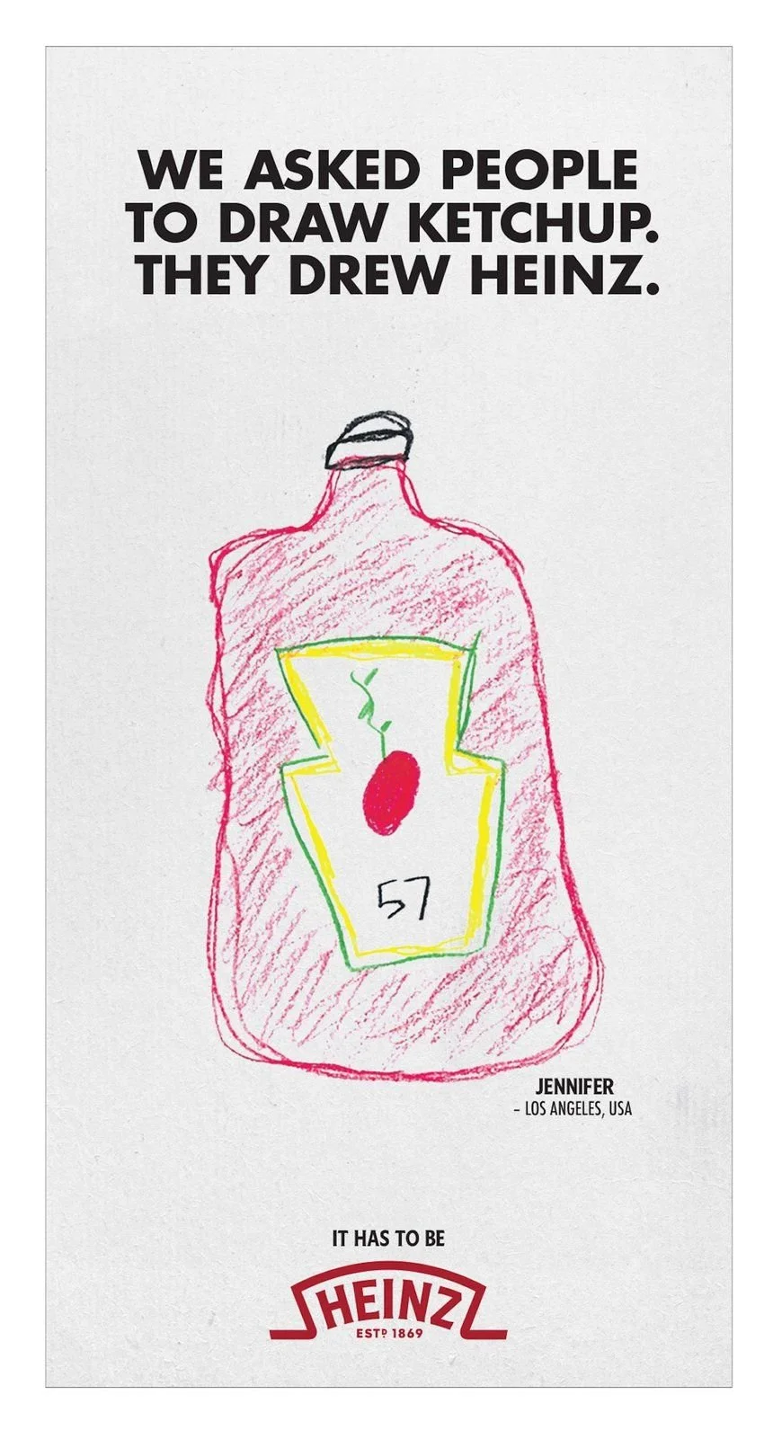
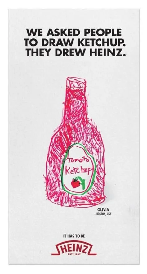
Within the Heinz “Draw Ketchup” ad campaign, people from around the world were asked to draw ketchup. According to the ad, the drawings came out as Heinz bottles. By using these unpolished, hand-drawn images paired with the artist’s name and location, Heinz makes the ad look real and authentic, rather than like a corporate production. This is a form of astroturfing, an advertising strategy that creates the illusion of organic, widespread support. It makes viewers feel as if Heinz isn’t just a brand, but the natural, universal definition of ketchup.
The campaign also relies heavily on the mere exposure effect, a psychological principle that the more we see something, the more likely we are to view it as the default. By repeatedly showing these homemade drawings of Heinz bottles, the ads reinforce a cultural shorthand: ketchup equals Heinz. Even if a viewer doesn’t consciously register the persuasion, the repetition cements familiarity and brand dominance.
This campaign highlights a broader shift in advertising toward “authentic” content. In an era when polished corporate ads can feel less trustworthy, Heinz uses real people’s artwork to give their message a more genuine voice. The result is both nostalgic and persuasive: no matter who you are or where you’re from, when you think ketchup, you think Heinz.